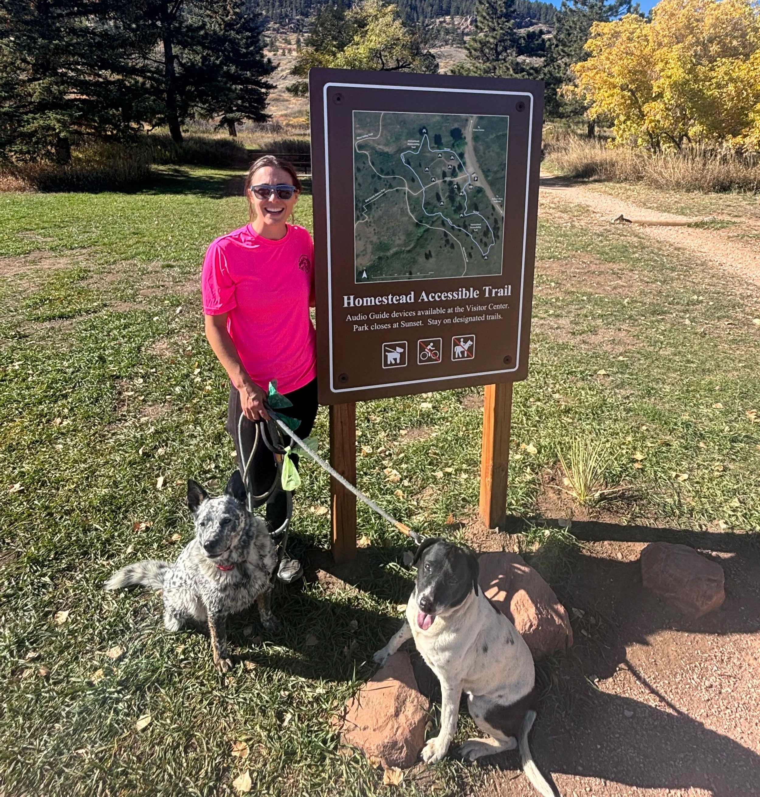
Accessible Trail Signage: What Good Kiosk and Map Design Actually Looks Like
A conversation I end up having surprisingly often is about signs, maps, and kiosks.
And honestly, it makes sense. Unlike programming or temporary materials, signage is expensive, highly visible, and intended to last for years. Once it is installed, changing it can be difficult and costly. Organizations want to get it right the first time.
But signage also plays a much bigger role in accessibility than many people realize. It can completely shape whether someone feels confident enough to even start down a trail.

I’ve seen trailheads labeled “accessible” with almost no useful information attached. No trail grade. No surface description. No distance to the viewpoint. No mention of benches, shade, or barriers. Just one word that is somehow supposed to work for everyone.
The reality is that accessibility is incredibly individual. A trail that works well for one person may be exhausting, unsafe, or impossible for someone else. That is why I frequently point organizations toward two resources I reference constantly: the Green Goat Maps Guide to Accessible Kiosk and Map Design and recommendations from Trails for All People. I did not create either of these resources, but they do a great job translating accessibility concepts into practical action.
One of the biggest themes across both resources is specificity. Instead of vague descriptions like “easy” or “accessible,” visitors need objective information they can use to make their own decisions.
That means including things like:
Trail surface type
Average and maximum grade
Trail width
Distance to viewpoints or amenities
Bench locations and resting opportunities
Cross slope
Known barriers or obstacles
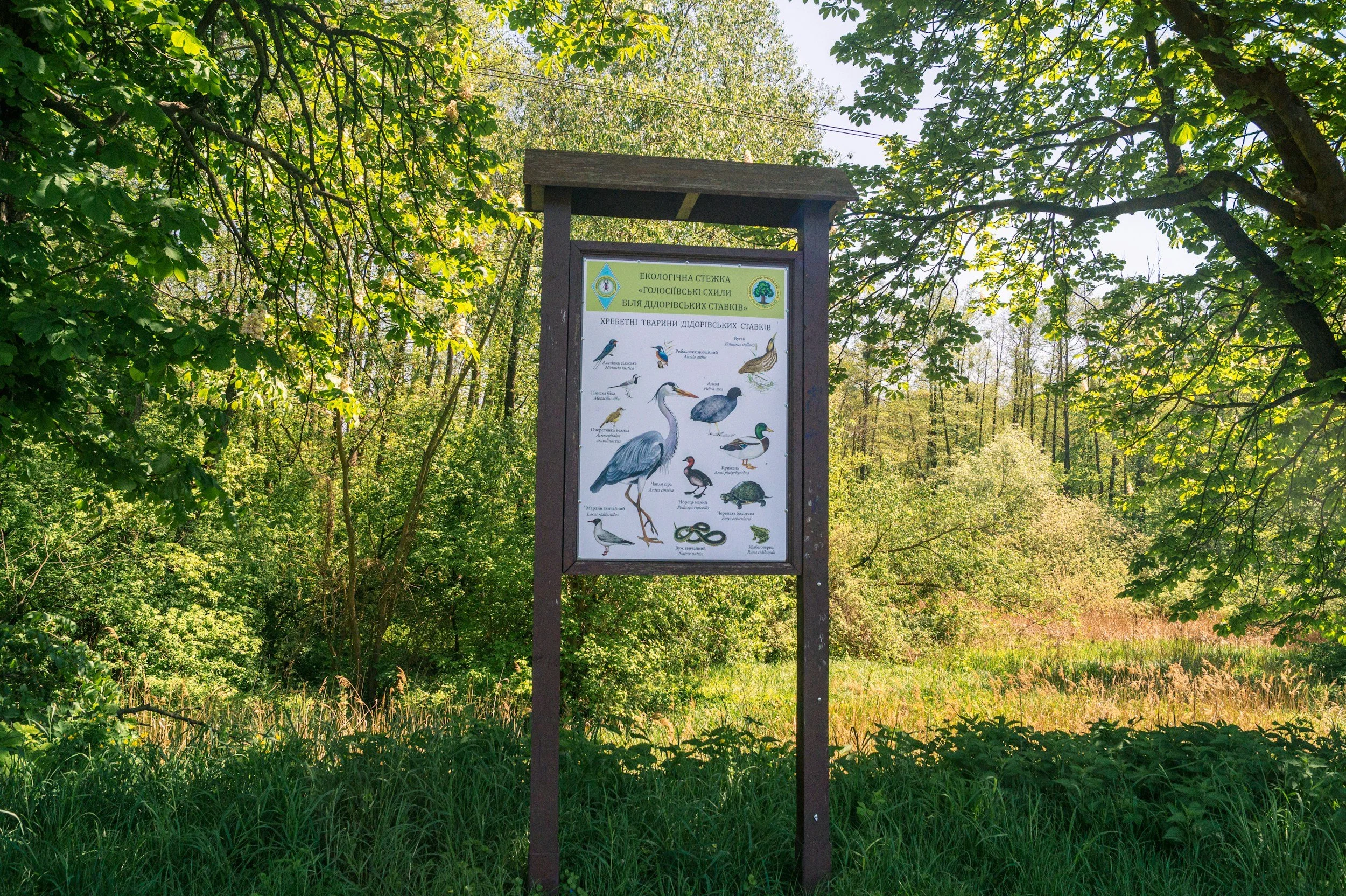
But accessible signage is also about how information is presented. I think many organizations underestimate how difficult kiosks can be to actually read and use in outdoor environments. Bright sun, visual clutter, small text, and crowded maps can make information inaccessible long before someone even gets onto the trail.
Some practical recommendations I frequently share include:
Use high color contrast (dark text on a light background is usually easiest to read)
Avoid large blocks of text whenever possible
Keep sentences short and direct
Prioritize the most important information first
Use consistent symbols and icons throughout the system
Include plain language alongside technical information

For text size, many accessibility recommendations suggest:
Headings around 60–72 pt minimum
Body text at least 18–24 pt for outdoor readability
Large map labels and directional markers that can be read from a reasonable distance
A good rule of thumb is that if someone has to lean forward or physically strain to read the sign, the text is probably too small.
The Green Goat Maps resource also recommends limiting unnecessary wording. People rarely stand at a kiosk wanting to read several dense paragraphs. Most visitors are trying to answer a few immediate questions quickly:
Where am I?
Where can I go?
Can I realistically do this trail?
What should I expect?
Another thing people overlook is physical placement. I have seen beautifully designed kiosks installed in deep gravel or on uneven slopes where wheelchair users cannot even position themselves close enough to read the information comfortably. Accessibility is not just about the sign itself — it is also about whether someone can approach and use it independently.
Good signage does more than provide information. It reduces uncertainty. It builds confidence. And it communicates something important to visitors before they even step onto the trail: “We thought about your experience before you arrived.”